Tom Anderson must have been feeling left out after the release of The Social Network and all its success in theaters. After all, it’s not his fault that the history of MySpace is apparently not tawdry or exciting enough to warrant a big screen treatment.
But whatever the reason, MySpace is being overhauled, and you have to get the feeling that this has been a long time coming. And rather than stealing all of Facebook’s features and trying to convert users back to where social networking really got started (which would almost certainly fail), Tom Anderson and MySpace are marketing their redesigned site to “fans of the world,” aiming to make it the social entertainment destination. They want this to become the place Generation Y (13 to 35-year-olds) goes to share everything that has to do with music, movies, TV, celebrities, and games. In a way, you can think of it as Apple’s Ping, but applied to the rest of entertainment as well.
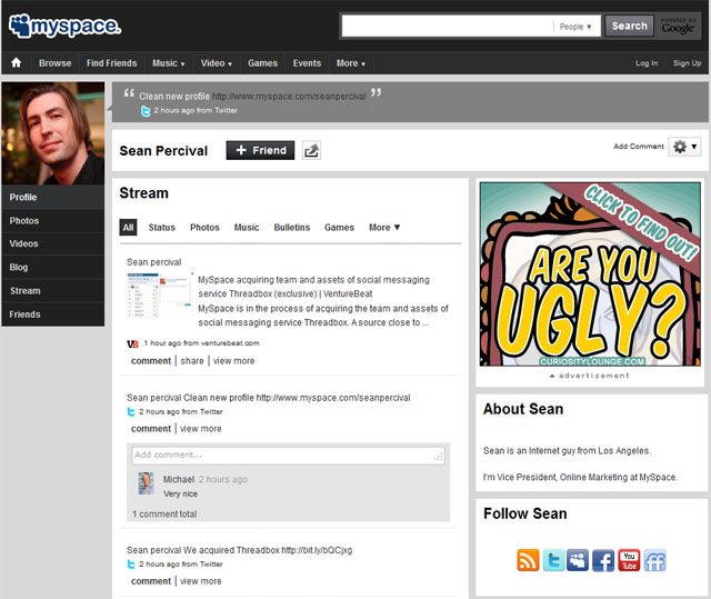
There’s no doubt screenshots of the new MySpace present a startling contrast to what we’ve seen before. Left hand navigation is intended to simplify browsing profiles; the MySpace Stream acts as a different version of Facebook’s newsfeed; users can opt to follow each other not only on MySpace, but other networks as well; and, the user interface looks like a completely different site . . . This whole new presentation also has better chances of going unmolested, thanks to a big reduction from 152 templates and 81 button styles down to seven templates and two buttons.
Topping things off, we can expect a brand new mobile experience in the near future. This represents a big opportunity for MySpace, seeing as Facebook’s mobile app is the target of a lot of scorn . . . So, will all this be enough to bring Myspace out of its slump? We’ll find out soon. But it was definitely time for a change. They got that much right.